A new report from the Institute and Faculty of Actuaries just dropped a number that should stop every risk officer mid-scroll: global GDP could fall by 50% from climate risk shocks. Not over centuries. Within decision-relevant timeframes.
And yet, the dashboards most organizations use to monitor climate exposure are still built like marketing demos. They render beautifully. They impress in board meetings. And they fail completely when someone needs to make a capital allocation decision at 2 AM after a hurricane forecast shifts 200 km inland.
I have spent seven years building climate data pipelines and ML infrastructure for insurers, asset managers, and public agencies. The pattern is consistent: teams invest six figures in dashboard platforms, populate them with the right datasets (ERA5, CMIP6, CHIRPS, Copernicus CDS), and still end up making critical decisions in spreadsheets. The problem is not the data. It is the architecture.
The Three Failures Nobody Talks About
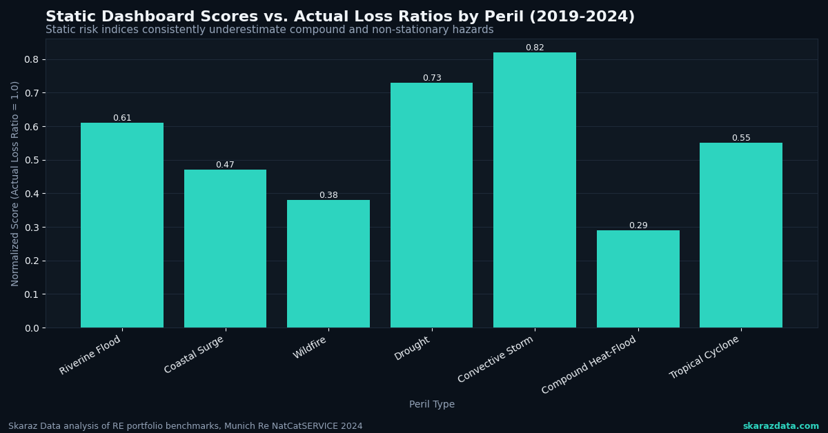
Failure 1: Static risk scores on dynamic hazards.
Most climate dashboards display pre-computed risk indices. A property gets a score of 7.2 for flood risk, and that number sits unchanged until the next quarterly refresh. But climate hazards are non-stationary. The compound probability of a flood event shifts week to week based on soil moisture, upstream snowpack, sea surface temperatures, and precipitation forecasts. A static score is a snapshot pretending to be a movie.
The fix is not “more frequent updates.” It is building pipelines that fuse historical reanalysis data with near-real-time satellite observations and ensemble weather forecasts. When I build exposure monitoring systems, I pull from ERA5-Land at 9 km resolution for baseline climatology, overlay Sentinel-1 SAR imagery for current ground conditions, and run ensemble forecast spreads through a calibrated risk model. The output is not a single number. It is a probability distribution that updates every 6 hours.
Failure 2: Pretty maps with no decision logic.
The “sentient cities” concept gaining traction (Context by TRF covered this recently) makes an important point: infrastructure decisions demand prediction and adaptation, not just visualization. The same applies to climate risk. A heatmap of flood zones is useful for awareness. It is useless for deciding which 12 of your 400 facilities need emergency prep this week.
Dashboards need embedded decision logic. That means threshold-based alerting tied to specific operational triggers, scenario comparison tools that let users adjust assumptions (RCP 4.5 vs. 8.5, 10-year vs. 50-year return periods), and automated ranking of assets by conditional expected loss. The visualization layer should be the last 10% of the system, not the first 90%.
Failure 3: Security and infrastructure as afterthoughts.
Cloudflare and WatchGuard recently warned that cloud security assumptions are failing across the board, with identity attacks, AI-driven threats, and weak configurations exposing organizations. Climate dashboards are not exempt. They often handle sensitive asset location data, proprietary risk models, and portfolio exposure details. Yet most are deployed on default cloud configurations with minimal access controls.
I have seen climate platforms running on publicly accessible S3 buckets with API keys hardcoded in frontend JavaScript. For dashboards processing geospatial asset data, you need row-level security on location data, encrypted model artifacts, audit logging on every query, and infrastructure-as-code deployments that can be reviewed and version-controlled.
What a Decision-Grade Dashboard Actually Looks Like
Here is the architecture I recommend after building these systems across insurance, agriculture, and public sector clients:
- Data layer: Automated ingestion from Copernicus CDS, NOAA GFS, Sentinel Hub, and client-specific asset registries. Parquet-based storage on cloud object storage with partitioning by geography and time. Delta Lake or Iceberg for ACID transactions on updates.
- Compute layer: Dask or Spark clusters for batch reprocessing of historical baselines. Lightweight Python services (FastAPI) for on-demand scenario modeling. Pre-computed materialized views for the 80% of queries that are predictable.
- Model layer: Calibrated probabilistic models, not black-box ML scores. Bayesian hierarchical models for regional hazard estimation. Transparent uncertainty quantification on every output. Model cards documenting training data, validation metrics, and known limitations.
- Decision layer: Configurable alert thresholds tied to client-specific risk appetites. Portfolio-level aggregation with correlation adjustments (because a flood hitting three facilities in the same watershed is not three independent events). Scenario comparison tools with exportable audit trails.
- Presentation layer: Yes, maps. But also tabular ranked views, time-series trend panels, and plain-language summary cards generated from the model outputs. The goal is to reduce time-to-decision, not to maximize visual impressiveness.
The GDP Problem Is a Data Problem
That 50% GDP impact figure from the actuaries’ report is not just alarming. It is a signal that current risk quantification methods are systematically underestimating tail scenarios. Most climate risk models used in financial services still rely on smooth damage functions calibrated to historical losses. They do not capture compounding cascades, supply chain propagation, or the nonlinear tipping points that dominate the worst-case scenarios.
Building dashboards that account for these dynamics requires moving beyond simple hazard-times-exposure-times-vulnerability calculations. It means integrating network models of economic interdependence, stress-testing portfolios against correlated multi-hazard scenarios, and being honest about the uncertainty bounds. A dashboard that shows a single number with false precision is more dangerous than no dashboard at all.
The Bottom Line for Decision Makers
If your climate risk dashboard cannot answer the question “which three assets need action this week, and what specifically should we do?” then it is a reporting tool, not a decision tool. The difference matters when the stakes are measured in billions.
At Skaraz Data, we build climate risk pipelines and decision-grade dashboards for organizations that need their data infrastructure to perform under pressure, not just in demos. If your team is hitting the limits of what your current platform can deliver, that is a conversation worth having.